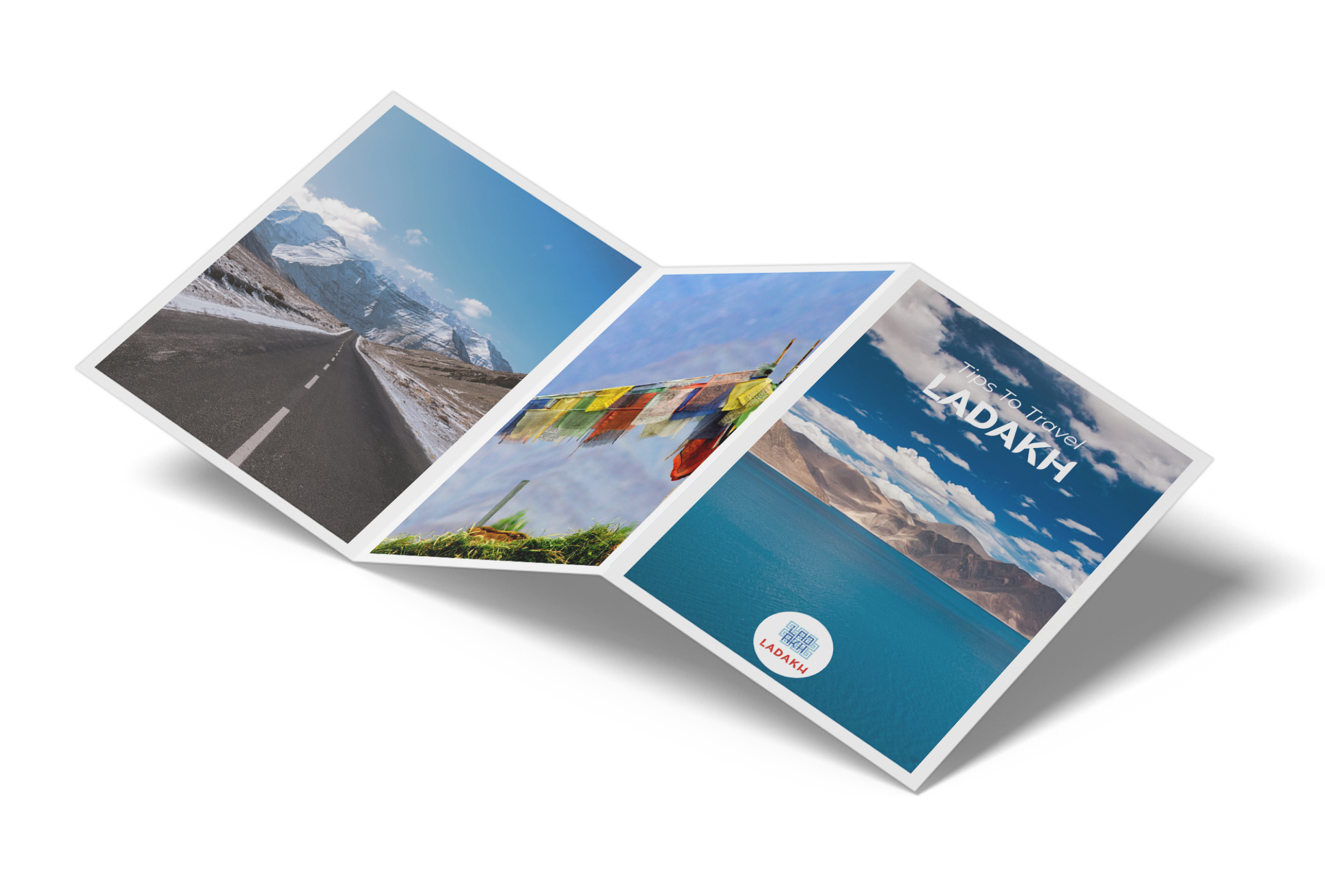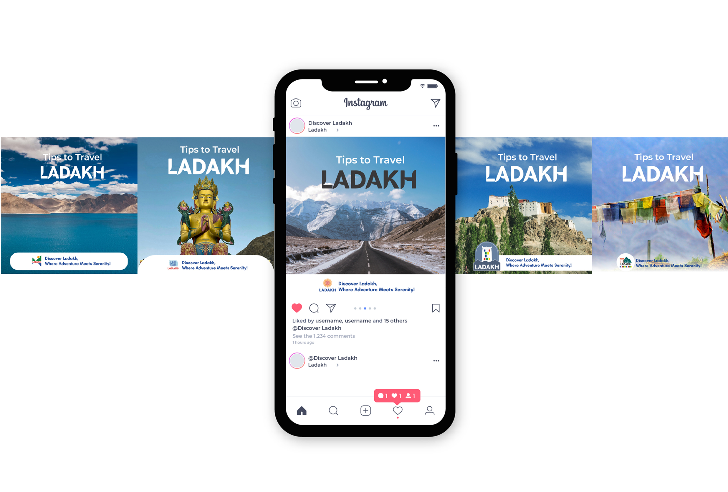
The branding for Ladakh Tourism draws inspiration from the region’s monasteries, sacred Buddhist traditions, pristine lakes, vibrant prayer flags, and distinctive wildlife. The visual language blends the bright colors and intricate motifs of monastery art with the dynamic colors and movement of prayer flags, creating a sense of spirituality and vitality. Gradients of turquoise and blue echo the serenity and reflections of Pangong Tso and other lakes, while bold illustrations of the yak, and the mountains celebrate the rugged wildlife and adventurous spirit of the Himalayas.
Complemented by mandala-inspired geometry and motifs rooted in Buddhist symbolism, the identity weaves together culture, nature, and spirituality into a cohesive system for collaterals—ranging from brochures, posters, and guides to event branding, merchandise, and wayfinding—positioning Ladakh as both a sanctuary of peace and a land of wild exploration.
NA
COMPLETED
AMRITA DASGUPTA
RASHI KHEMKA, SHREYA CHATURVEDI