Commercial Design, Mall Design
Commercial Complex, Aquapolis
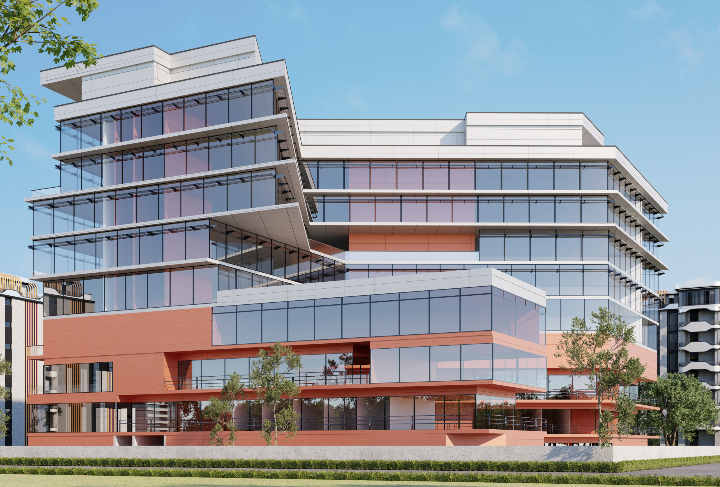
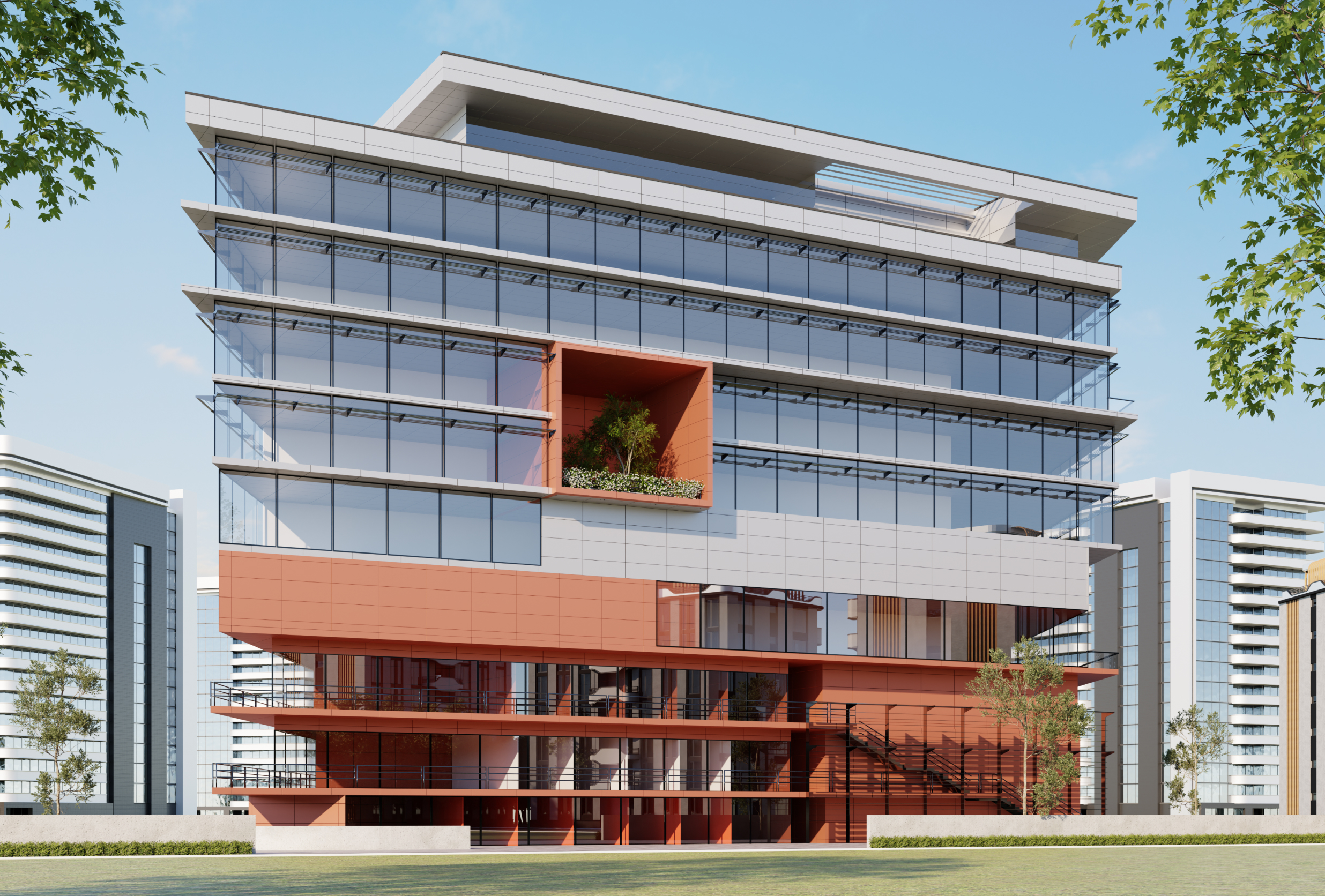
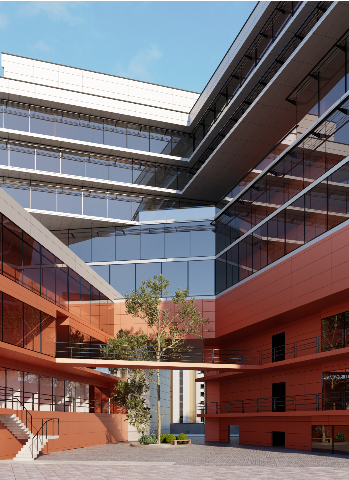
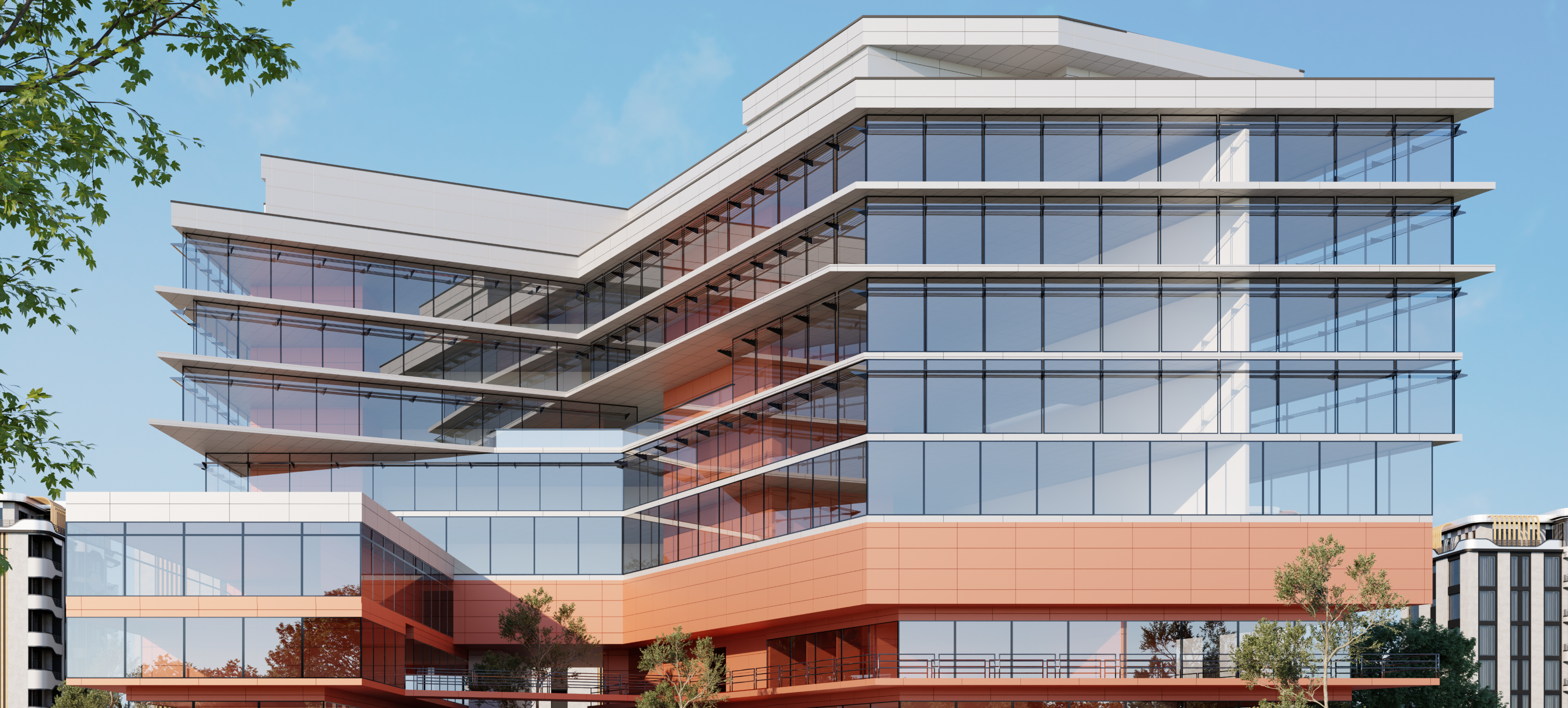
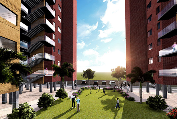
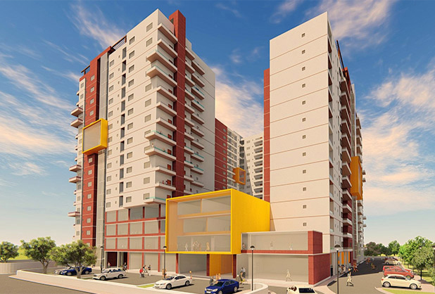
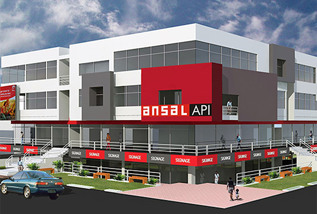
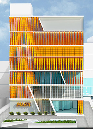
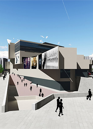
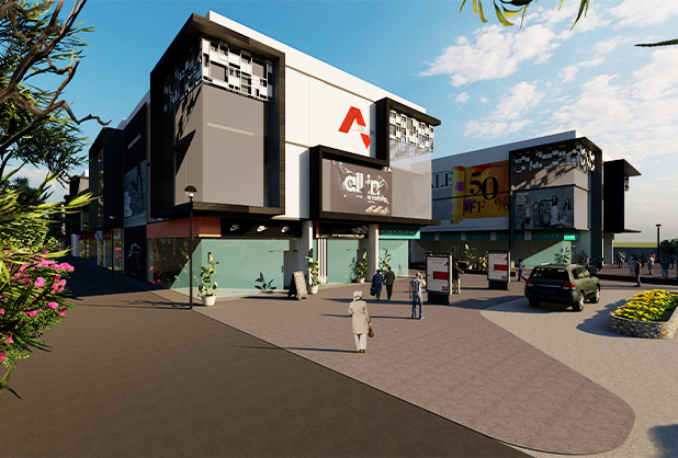
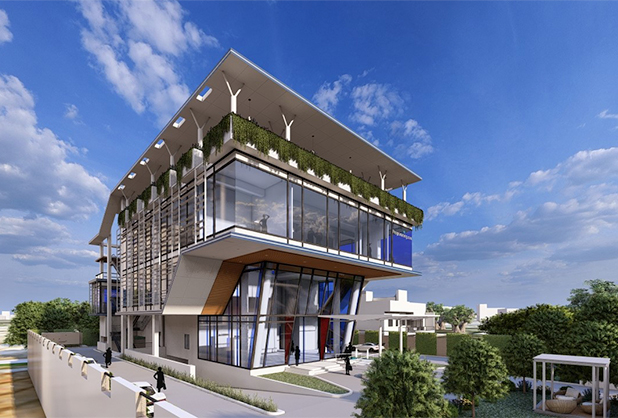
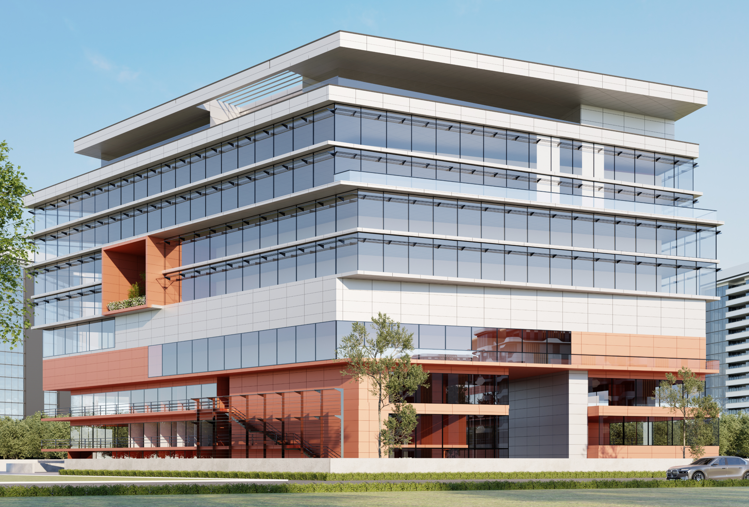
The commercial complex was designed as two wings at the base which joins at the upper floor creating a gateway entry into the complex which then opens into a public courtyard. One wing was designed for a corner hyper-mart and car dealer duplexes. The other wing had bigger shops. The retail floors spans upto first floor and the offices from third floor to seventh floor level. The restaurants and the food courts were kept at the second and the third floor level so that they can be easily accessed by the retail and office users while using the large terraces as spill over space. The banquets were kept at the topmost floor so that the terraces can be used for large gatherings with a separate access core from the basement parking.
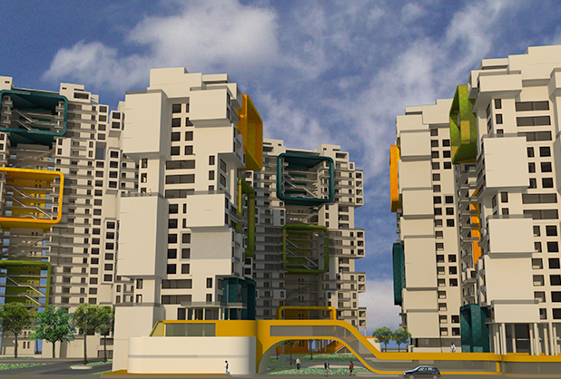
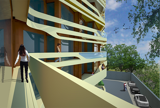
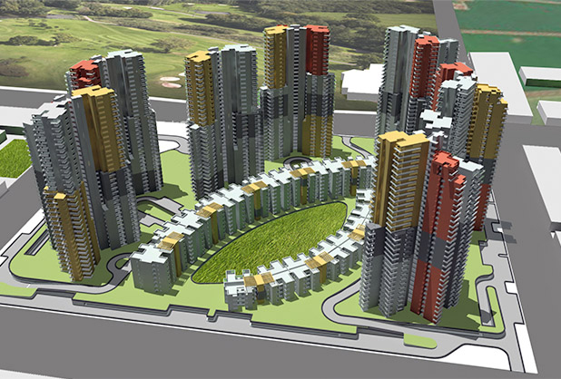
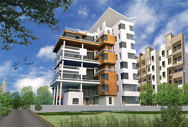
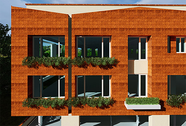
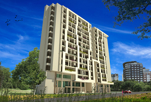
The massing of the project was conceived in a way to generate visual interest while using the quadrangle geometry of the site. The play of volume was done by lowering one of the wings to create terrace space and add openness to the courtyard. The slabs of the L- shaped tower over the retail floors were expressed in the elevation as extensions to create a play of light and shadow with the sun movement as well as to cut the solar heat gain.
-
SIZE:
5148 SM Site Area, BUA: 21040 SM / 2,26,390 SQ.FT
-
STATUS:
DESIGN DEVELOPMENT
-
DESIGN PRINCIPAL:
VIKAS KANOJIA, RAJIV BHAKAT
-
DESIGN TEAM:
KARAN GUPTA, NIROOPA SUBRAHMANYAM, AMAN KANSAL
-
COLLABORATORS:
